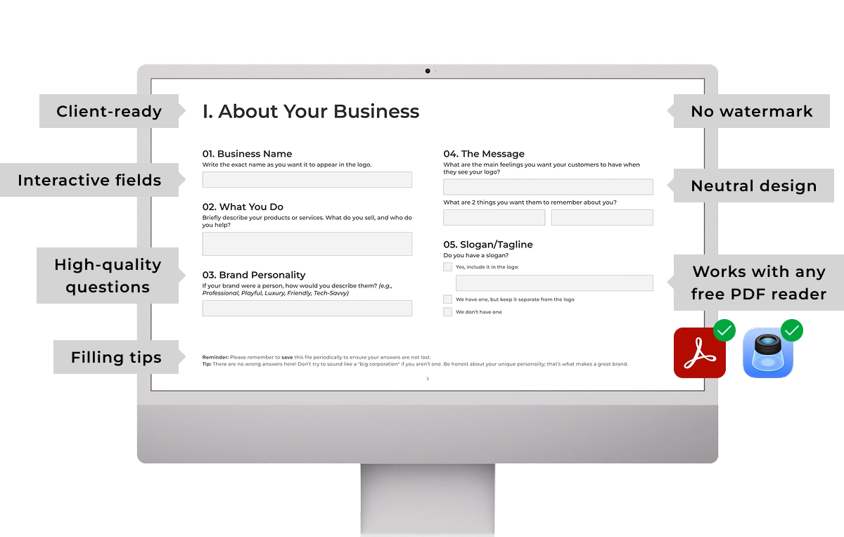





The first question in my Logo Design Brief asks the client to write their exact business name. You need this to prevent embarrassing late-stage typos. But there is another psychological layer this question reveals. How a client types their name dictates a visual strategy that most agencies completely ignore.
Here is the strategic breakdown of the psychology behind text case in visual communication.
The psychology of lowercase
Think about how people write casually to a friend or family member. They do not worry about grammar or capitalization. They just type. This lack of formal punctuation creates a relaxed, conversational tone. Because of this everyday habit, consumers subconsciously interpret lowercase text as friendly, highly approachable, and informal.
When to use it: Lowercase works best for brands that want to eliminate barriers between them and the user. Notice that consumer-focused social networks like Facebook or Reddit use lowercase logos to signal accessibility and community.
The standard of sentence case
When people write in a professional capacity to a colleague or a client, they keep their grammar in check. Proper nouns are capitalized, and punctuation is deliberate. In a professional environment, clarity is highly important. Because correct grammatical writing is the baseline for serious communication, people psychologically associate sentence case with professionalism and reliability.
When to use it: This is the visual standard for corporate entities and B2B services. Professional networks like LinkedIn use sentence case, alongside massive legacy corporations that appeal to professionals, like Microsoft or Google.
The authority of uppercase
When people want to impose themselves in text, they use all caps. In written communication, this is universally recognized as talking loudly. Since taking up maximum visual space is associated with dominance, all caps are inherently seen as authoritative and powerful.
When to use it: This format is reserved for entities that demand respect or dominate a specific field. You see this with authority organizations like the police, or global industry leaders like Tesla or Nike.
Don’t just copy and paste client text
When a client types their name in all caps into your brief, do not just copy and paste it onto an artboard. You must verify that this authoritative stance aligns with their actual brand attributes. If they are a friendly local bakery, an all-caps logo creates a psychological disconnect for their customers.
You cannot assume clients understand the nuances of visual communication. It is your job to mandate the roadmap and steer them toward the right strategy.
If you need a hands-off way to extract this exact information before you start designing, I created an interactive Logo Design Brief. It eliminates operational drag on logo projects and works seamlessly in any free PDF reader. You just send it, they fill it out, and you get your time back.
Don’t chase clients for details
Get a professional, comprehensive, client-ready brief that works in any free PDF reader.