



I have seen designers posting a lot on LinkedIn about how a logo should not describe what a company does. They give examples like Nike's swoosh not being a shoe and McDonald's golden arches not being a burger. But they rarely explain why.
Here is the strategic breakdown of the psychology behind why and when to use literal, suggestive, or abstract imagery in logo design.
Literal logos
This type of logo illustrates exactly what the business does, sometimes in detail. Think of a car wash logo that features a shiny car being washed. Inexperienced designers often scoff at these, but they serve a crucial business purpose.
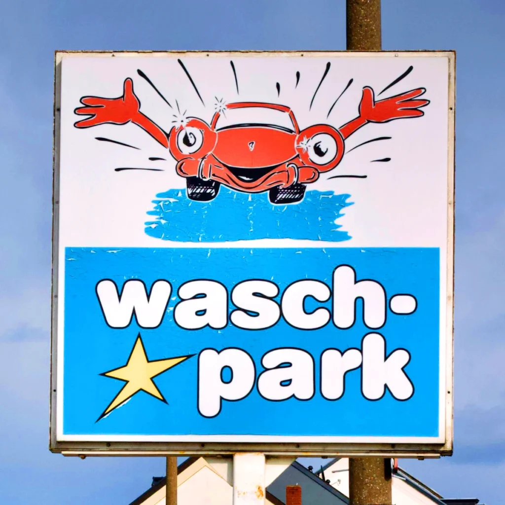
When to use it: Literal logos work best for local, utility-based businesses where clarity trumps cleverness. The target audience is making a split-second, immediate-need decision. They do not have the time to decipher a clever abstract symbol. The cognitive load must be zero so the customer knows exactly what they are getting instantly.
Suggestive logos
This type of logo is highly effective because it describes what the company does suggestively, rather than literally. Burger King smartly uses two bun-like shapes wrapped around the text to suggest a burger.
When to use it: This is the industry standard for most growing companies. It is perfect for middle-market brands that need to build unique brand equity while still communicating their core offering to the public. It requires a slight mental connection, which makes the brand memorable without causing confusion.
Abstract logos
This is the type of logo that has nothing to do with the product visually. The shape intersects with the company's purpose only on a philosophical level. The Nike swoosh suggests movement and speed, while nodding to the Greek goddess of victory. The Apple logo suggests knowledge, referencing the fruit from the Garden of Eden and Isaac Newton's discovery.
When to use it: Abstract logos are powerful, but they are expensive to establish. Because the symbol does not explicitly state what the business does, the company must spend significant marketing dollars to build that association in the consumer's mind. This style is best suited for luxury brands, high-end tech, or heavily funded corporations that have the time and budget to educate their market.
How to monetize this for your agency
A client who treats branding as an afterthought isn't just cheap; they are an operational risk to your agency. If a local plumber wants an abstract logo like Nike, it is your job to step in and correct the strategy. Never start a project without a brief that outlines goals and market positioning.
I bridge the gap between "agency quality" and "freelancer flexibility". I eliminate the overhead of full-time hires, allowing you to attract better clients without adding to your management burden. If you need a brand strategist to deliver seamless execution, my brand design services start from $1,500.